Change Region
You're on our English website. Change your region to see information for another location.
You're on our English website. Change your region to see information for another location.

For this third edition of this Fully Booked blog series, I want to focus on the biggest toolkit marketing teams have: their website.
It is very timely to write about this for the blog, as the RMS team is also in the process of redesigning our own website (more on that in a few months). You’d be forgiven if you looked at our current website and thought I do not know what I am talking about when it comes to good website design.
But we’ve enlisted a wonderful agency to help us with it, and we’ve done a ton of research of what modern SaaS websites look like, so I feel that we are in a good place to share some of our lessons learned.
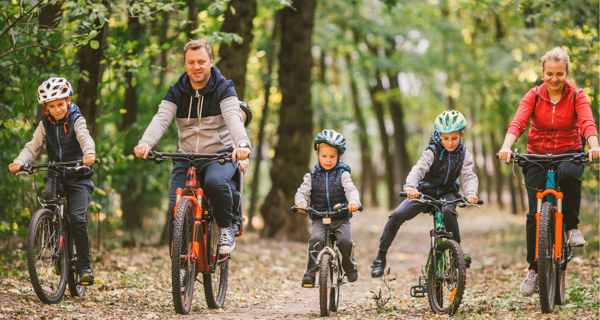
For parks and hotels, just the same as for software companies, the website is the core shopping window of the business. It is where your clients are most likely to end up on and what may sway them to get in touch or book a room with you, so there is no room for error.
A new website - or a website refresh - is a big project and there is a lot to unpack, so I’m going to split this topic in three blogs: here we will cover website design core principles. Next month, I’ll discuss photography, and in June, we will look at booking engine – very timely again as RMS will be launching its new booking engine around that time.
Long gone are the days where you needed coding skills to build a website. Today, many software companies offer out-of-the-box websites that anyone can turn around with minimal efforts. Pages are templated so you can simply drag and drop your images, edit the copy, clone the pages if you have to add more. Companies such as Karmabunny or Roomstay offer bespoke website building software specifically for hospitality providers, with bespoke wireframes and landing pages so the effort really is minimal.
That said, if your business is complex—for example, if you have multiple properties or multiple brands within your portfolio—it can get complicated very quickly, and you might end up needing an agency to help you with the navigation and structure.
At RMS, despite being a software company ourselves, we have chosen to go to an agency for this redesign. There were multiple reasons behind it, but the main one was that we wanted to retain our domain authority (a search engine ranking score that predicts how well your website will rank in search engine result pages) and our domain traffic. In short, we want to upgrade it and not lose anything in the process, so that felt like it needed specialist attention.
So, there is no right or wrong when it comes to who can build your website best. As a rule of thumb, I would say if you build a brand-new website from scratch for a single property, that should be manageable in-house. If you are refreshing your current website, or if you have a complicated business, then I’d recommend outside help.
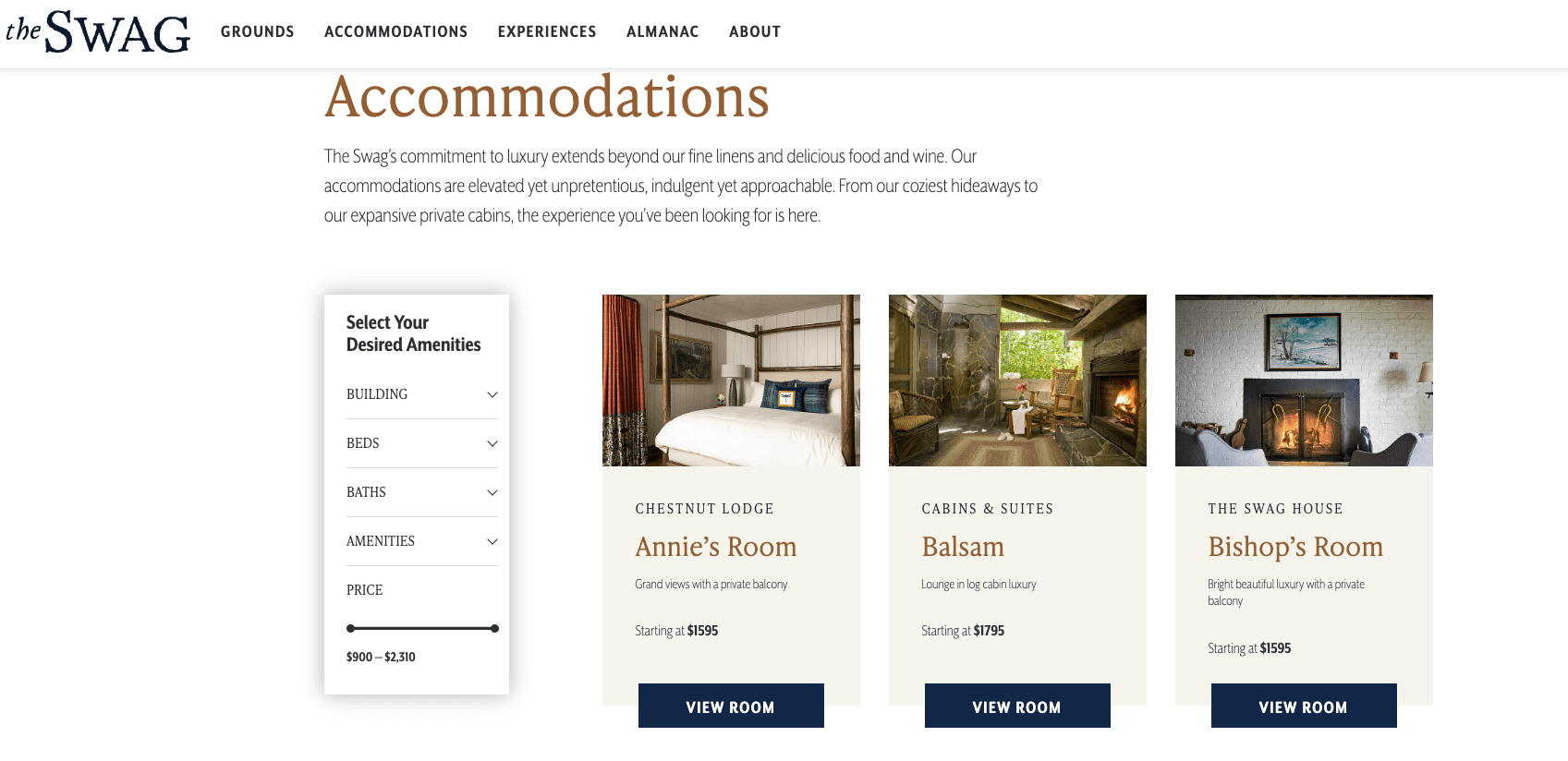
The first thing to consider when you work on a website is your navigation. What do you want to show? And what pages should you develop? There are multiple resources available on web user experience (UX) online, but one thing stands out to me every time: less is more.
Customers everywhere have less and less time to do their research and scan pages in a matter of seconds. So, if you spread your information over many pages, you will lose your browsers very quickly. Better to have a few well-built webpages than 25 half-baked ones.
As a minimum, here are the pages you should think to include in your website navigation:


A website overhaul is a big project and as such, it is likely you’ll miss or forget something. So here are some of the failures I’ve seen in the past and how to avoid them,
The spelling mistake you haven’t spotted, the dead link, the inquiry form that isn't connected to the right email inbox ... we’ve all been there. Only thing for it, testing, testing and more testing.
Ask other team members to test your site, ask your mum to test it: you will need multiple pairs of eyes on it to make sure you iron out every flaw.
When you build your plan, make sure you plan enough time for testing. You’ve put in the work, make sure you don't fall at the last hurdle because you didn't allow for an extra week of testing.
Many blogs, ebooks and whitepapers have been written on the topics of SEO. But the core principle remains true: even the best-looking website wont work if it cant be found by Google Search Engine and by ChatGPT. Make sure you deliver on the fundamentals of SEO like clear page titles, keyword-rich headings, image alt text and internal linking.
You will very likely build your website on a desktop, but your browsers are likely to view it on a mobile. Make sure you test on mobile. Even better, try and design with mobile –first in mind from the start - this helps avoid that annoying pop-up that disrupts the navigation and cannot be closed, and ensures your layout is fully mobile-optimised.
For everyone based in the EU, or anyone that has a website that an EU-based person may visit (that’s pretty much everyone), the European Accessibility Act will come into effect this year, forcing businesses to evolve their digital presence and their website so individuals with disabilities can access it.
There are a lot of resources available on the EAA, I find this one is a good one. You can use a free tool to assess your website’s accessibility. If it fails (and trust me, it is likely to fail), you’ll be provided with recommendations to make it compliant.
The EAA directive is a great opportunity to dust off your website or secure external resources to make your website compliant and better at driving conversions.
Easily done and easily fixable, make sure you add the links to your social network on your site. They typically live in the footer, but you can also link them from your gallery.
I’ve seen it in previous companies, and I’ve experienced it as a customer as well: I would sign up for a newsletter promising special offers and discounts, and then I hear crickets. Nada. Nothing. Not even an acknowledgement that I have signed up.
I’m not expecting to be inundated with offers the next day, but if you collect customers' and prospects' information, make sure you have a plan to act on it. Don't offer a newsletter sign-up if you don't actually send a newsletter. It sounds simple, but it happens more often than I’d like.
Your website isn’t just a digital brochure—it’s your most powerful marketing asset. Whether you’re managing a lodge, a resort, a park, a boutique hotel, or a SaaS platform, the principles of good website design remain the same: clarity, ease of navigation, strong visuals, and a clear call to action. As we embark on our own website design journey at RMS, I’m excited to share what we learned, successes, and failures along the way. Stay tuned for next month’s post, where we’ll dive into the importance of photography to turn browsers into bookers.

By Sandrine Zechbauer
Chief Marketing Officer